
The Container widget is a versatile widget that can be used to create a variety of UI elements. It can be customized in a number of ways, including its size, shape, color, shadow, gradient, borderRadius and border.
Size
The size of a container can be controlled using the width and height properties. These properties can be set to a fixed value or to a percentage of the parent container’s size.
Shape
The shape of a container can be controlled using the decoration property. The decoration property takes an instance of the BoxDecoration class, which has a number of properties that can be used to customize the shape of the container.
Some of the properties that can be used to customize the shape of a container include:
-
borderRadius: This property can be used to set the border radius of the container. -
shape: This property can be used to set the overall shape of the container. Some of the available shapes includerectangle,circle, androundedRectangle.
Color
The color of a container can be controlled using the color property. The color property can be set to a solid color or to a gradient.
Border
The border of a container can be controlled using the decoration property. The decoration property takes an instance of the BoxDecoration class, which has a number of properties that can be used to customize the border of the container.
Some of the properties that can be used to customize the border of a container include:
-
border: This property can be used to set the border of the container. -
borderRadius: This property can be used to set the border radius of the container. -
borderStyle: This property can be used to set the style of the border. Some of the available styles includesolid,dashed, anddotted.
Gradient
The gradient of a container can be added using the gradient property in the BoxDecoration. It take list of colors to configure the gradient using linear or radial gradient.
- gradient: This property can be used to set Linear or Radial Gradient to the container using LinearGradient or RadialGradient Widgets.
-
begin/end: These properties can be used to set the Alignment of Radial or Linear Gradient to the container. - tileMode: This property can be used to control how gradient is distributed throughout container. For exmple repeated, mirror etc,
Shadow
The shadow of a container can be added using the boxShadow property. It take list of BoxShadow to configure the shadow of the container.
- color: The color of the shadow can be set using the
colorproperty. Thecolorproperty can be set to any color value, such as a hex color or a named color. - blurRadius: The
blurRadiusproperty is a double value that controls the amount of blur applied to the shadow. - offset: The
offsetproperty is aOffsetobject that controls the position of the shadow relative to the container. - spreadRadius: The
spreadRadiusproperty is a double value that controls the amount of space between the shadow and the container.
Basic Example
Here is an example of how to customize a container:
Container(
  width: 200,
  height: 200,
  color: Colors.blue,
)
This code will create a blue container with 200 width and height.
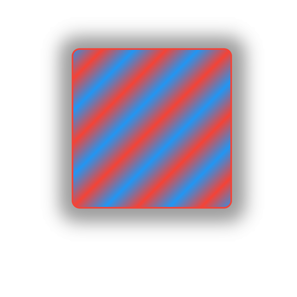
Advanced Example
example of how to customize a container:
Container(
  width: 200,
  height: 200,
  decoration: BoxDecoration(
    gradient: LinearGradient(
      colors: [Colors.red, Colors.blue],
      begin: Alignment(0, 0),
      end: Alignment(0.2, 0.2),
      tileMode: TileMode.mirror,
    ),
    boxShadow: [
      BoxShadow(
          blurRadius: 20,
          color: Colors.grey,
          offset: Offset(1, 1),
          spreadRadius: 10),
      BoxShadow(
          blurRadius: 20,
          color: Colors.grey,
          offset: Offset(1, 1),
          spreadRadius: 10)
    ],
    color: Colors.blue,
    borderRadius: BorderRadius.all(Radius.circular(10)),
    border: Border.all(color: Colors.red, width: 2),
  ),
),
This code will create a blue container with a rounded radius with 2px border of color red and has shadow and gradient applied.
Conclusion
The Container widget is a versatile widget that can be used to create a variety of UI elements. In this tutorial I included the mostly used configurations by Developers. I hope this covers every thing you wanted to learn about Container widget but If you want to see more like this Support us by sharing it to fellow developers.
Cheers!!
Leave a Reply